
This is part 4 of a series on “Handling Categorical Data in R” where we are learning to read, store, summarize, reshape & visualize categorical data.
Below are the links to the other articles of this series:
- Part 1 - Introduction to Factor
- Part 2 - Summarize Categorical Data
- Part 3 - Reshape Categorical Data
In this article, we will explore the different ways of visualizing categorical data using ggplot2.
Resources
You can download all the data sets, R scripts, practice questions and their solutions from our GitHub repository.
Introduction
In this section, we will learn to visualize categorical data. We will look at the following type of plots:
- univariate bar plot
- bivariate bar plot
- grouped
- stacked
- proportional
- mosaic plot
- pie chart
- donut chart
We will be using ggplot2 package throughout this article. So you should know the basics of data visualization with ggplot2. If you are new to or have never used ggplot2, do not worry. We have several tutorials and an ebook on ggplot2, you can go through them first and then come back to this article. Let us read the case study data before we start our visualization journey.
# read data
data <- readRDS('analytics.rds')
Bar Plot
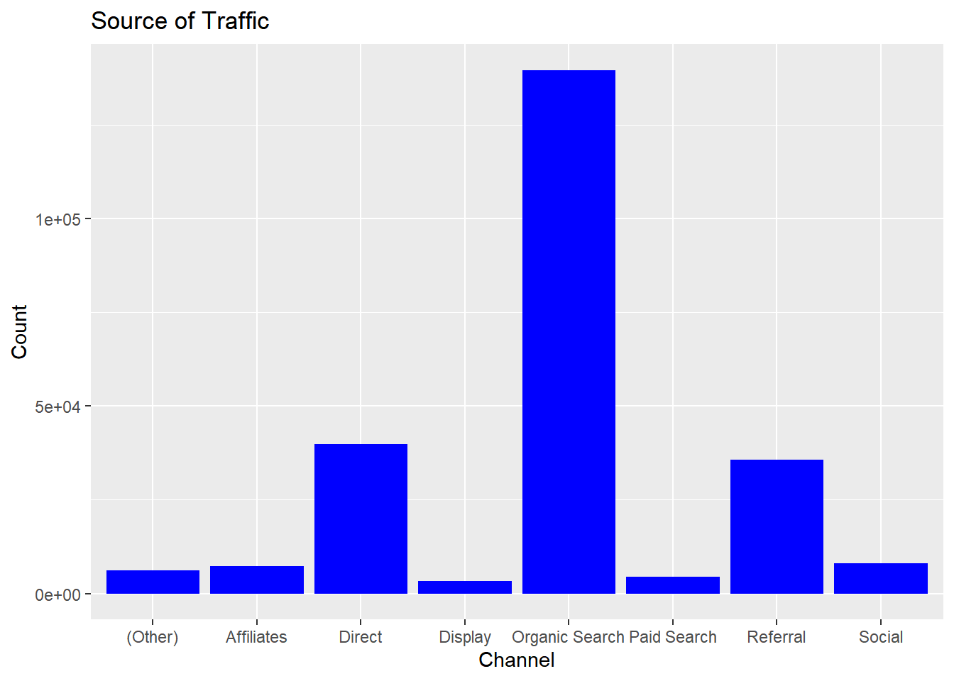
Bar charts provide a visual representation of categorical data. The bars can be plotted either vertically or horizontally. The categories/groups appear along the horizontal X axis and the height of the bar represents a measured value.
ggplot(data) +
  geom_bar(aes(x = device), fill = "blue") +
  xlab("Device") + ylab("Count")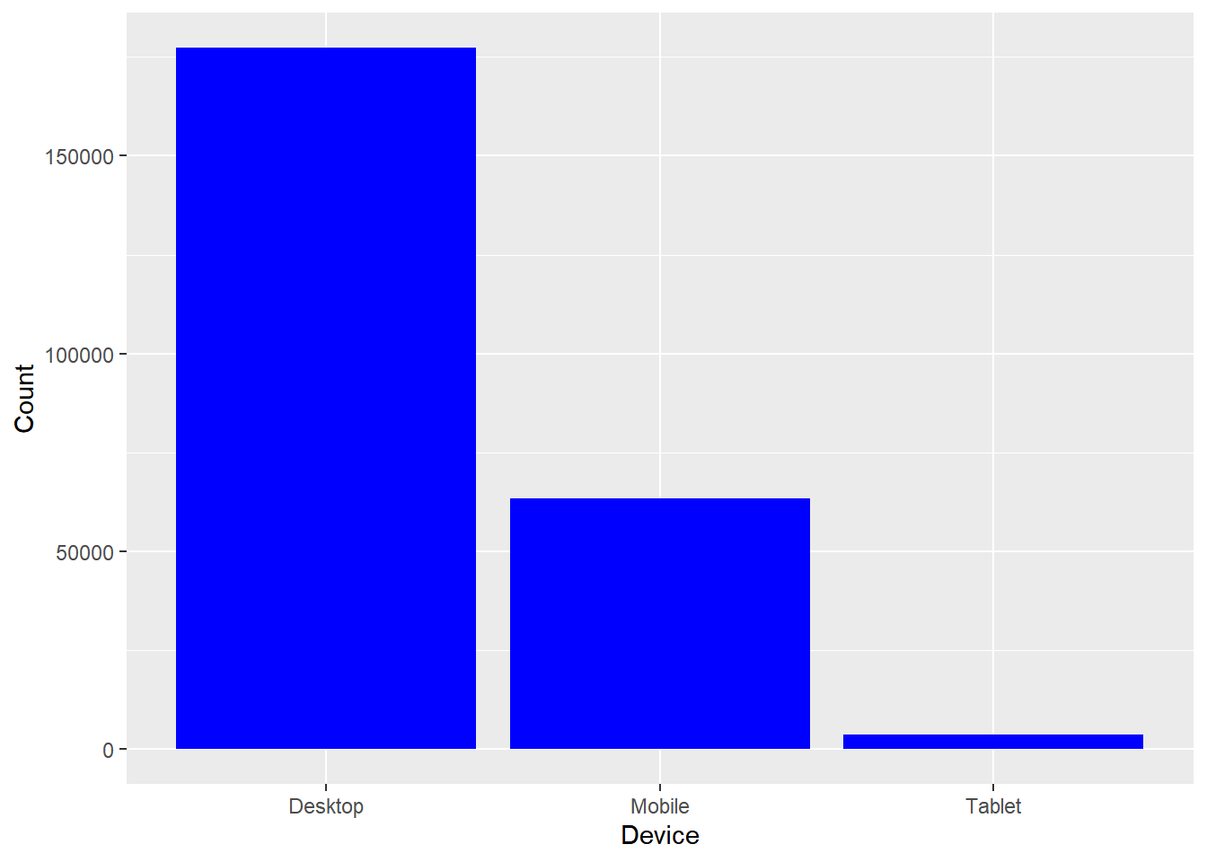
In the above example, the bars represent the count/frequency of the categories. If the bars represent continuous data, the value could be mean or sum of the variable being represented.
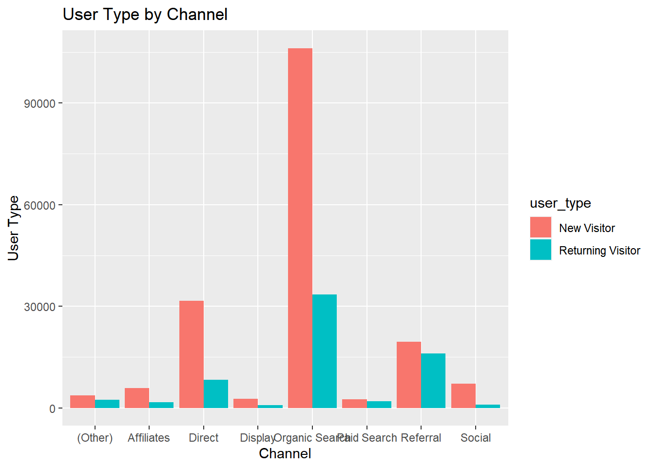
Grouped Bar Plot
A grouped bar chart plots values for two levels of a categorical variable instead of one. You should use grouped bar chart when making comparisons across different categories of data. Use it when you want to look at how the second category variable changes within each level of the first and vice versa.
ggplot(data) +
  geom_bar(aes(x = device, fill = gender), position = "dodge") +
  xlab("Device") + ylab("Count")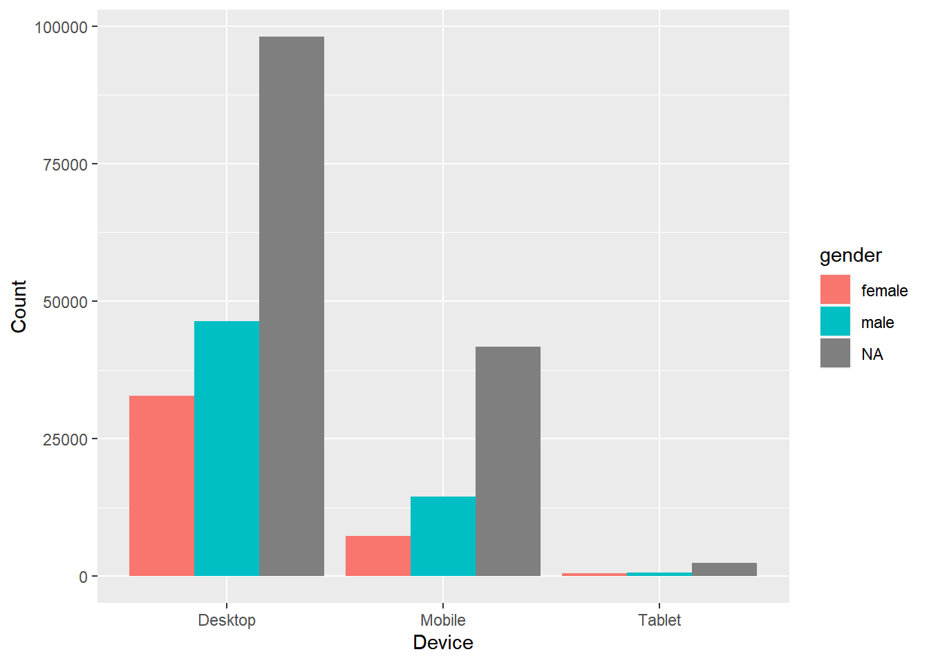
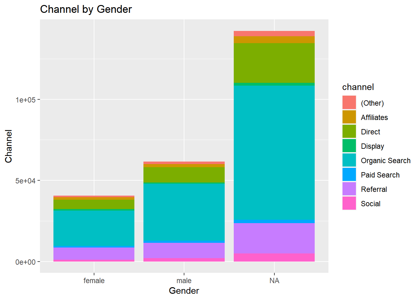
Stacked Bar Plot
In stacked bar plots, the bars are stacked on top of each other instead of placing them next to each other. Use stacked bar plots while looking at cumulative value.
ggplot(data) +
  geom_bar(aes(x = device, fill = gender)) +
  xlab("Device") + ylab("Count")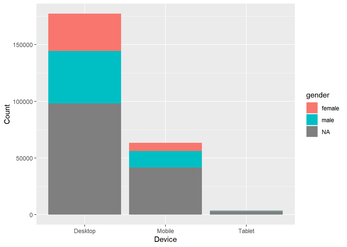
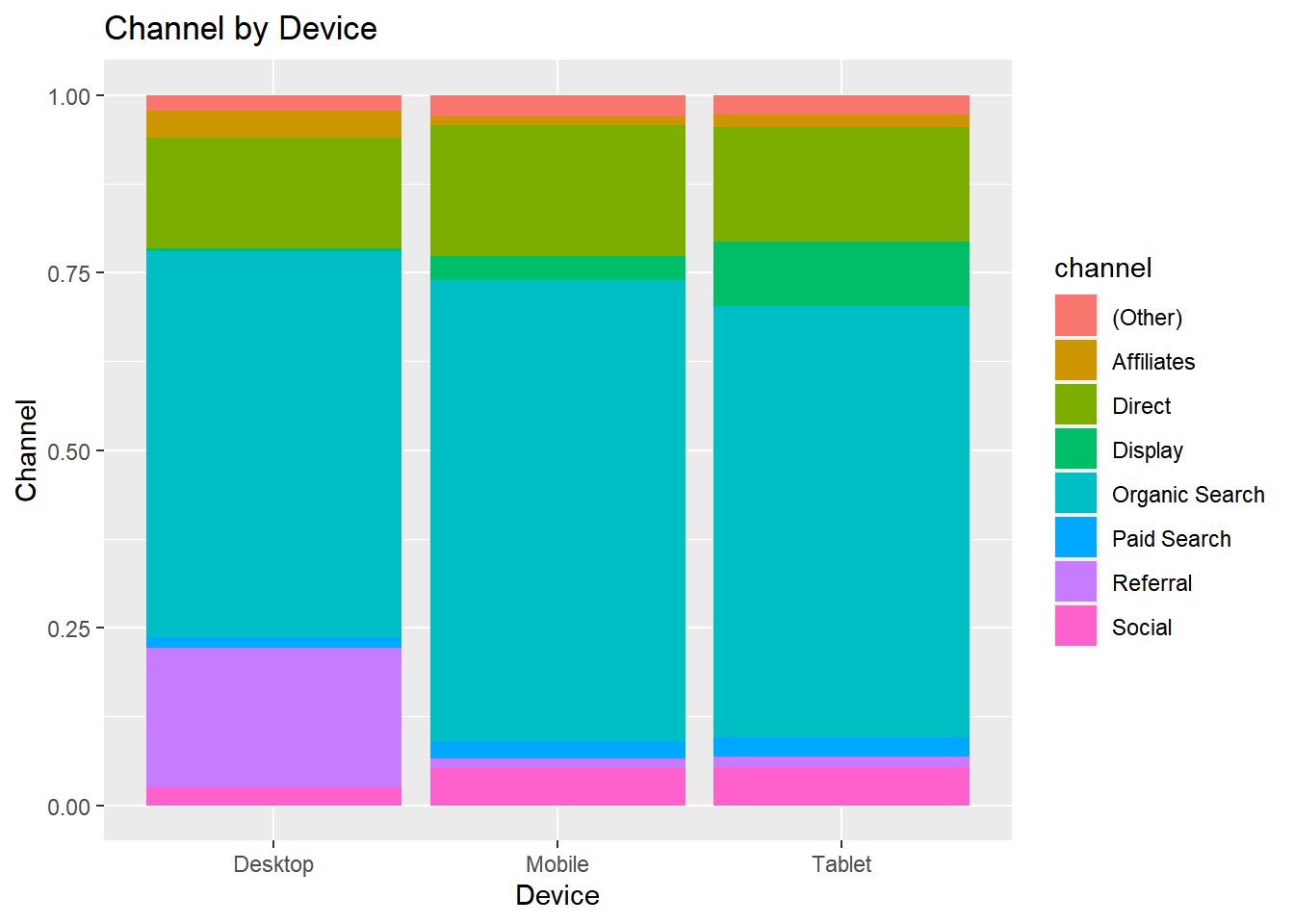
Proportional Bar Plot
Also known as percent stacked plot, the height of all bars in this plot are the same. The distribution of the second categorical variable is scaled to 1 or 100. The length of each bar is determined by its share in the category. Use this when you want to concurrently observe each of several variables as they fluctuate and as their percentage ratio’s change.
data %>%
  select(device, gender) %>%
  table() %>%
  tibble::as_tibble() %>%
  ggplot(aes(x = device, y = n, fill = gender)) +
  geom_bar(stat = "identity", position = "fill") +
  xlab("Device") + ylab("Gender")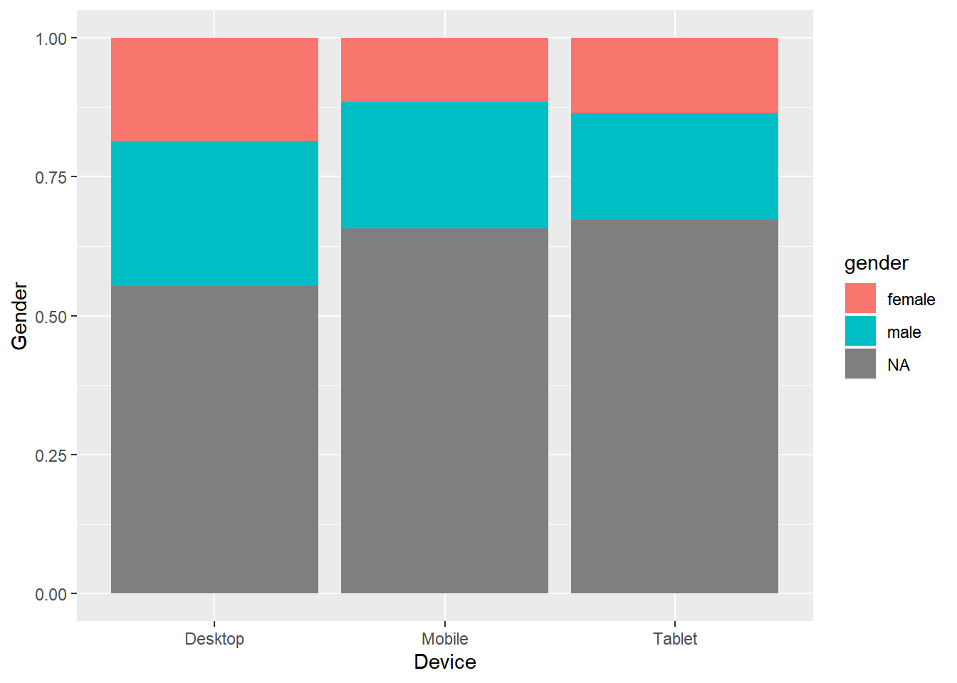
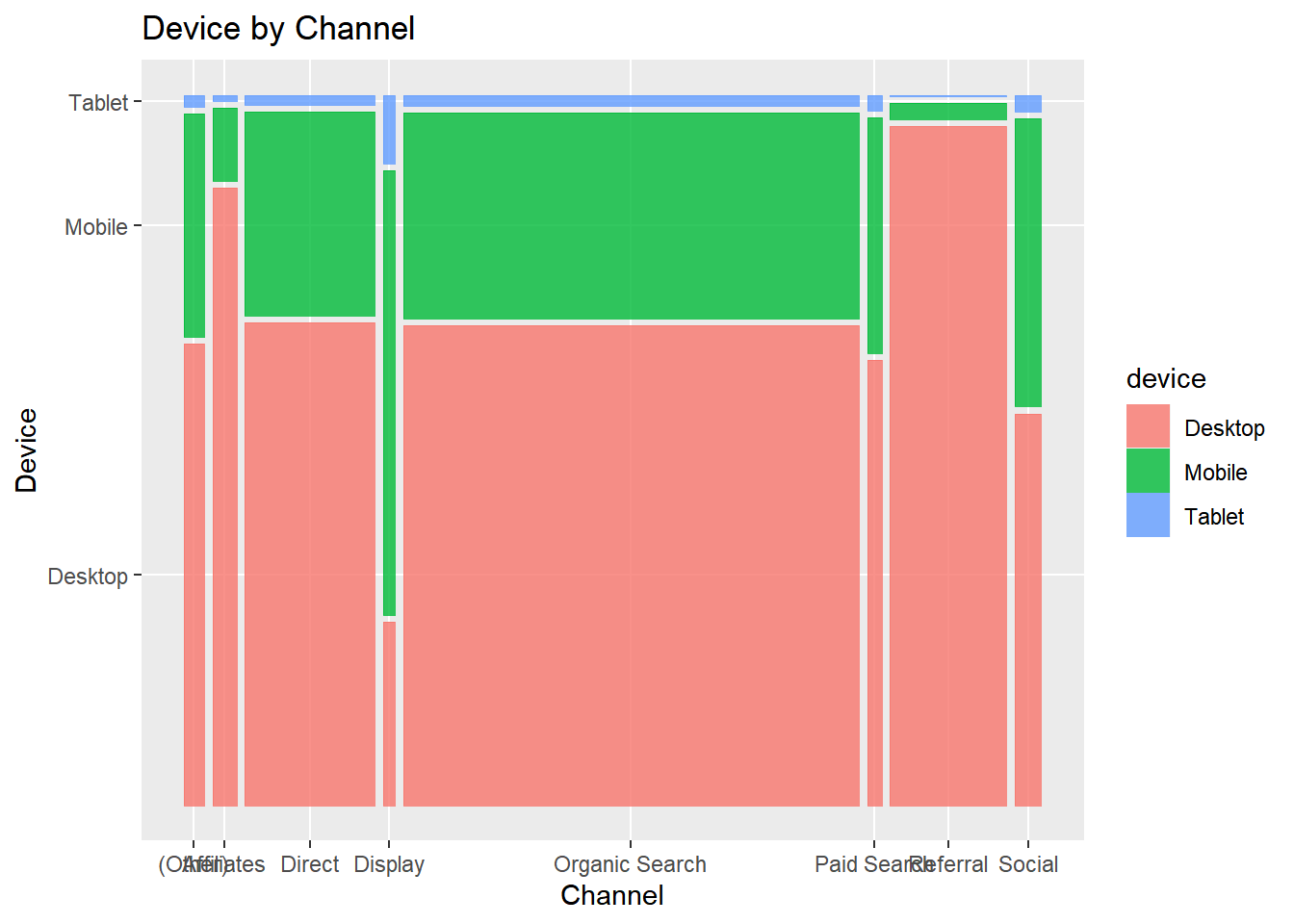
Mosaic Plot
A mosaic plot is a graphical representation of a two way table or contingency table. It was introduced by Hartigan & Kleiner and is divided into rectangles. Proportions on horizontal axis represents the number of observations for each level of the X variable. The vertical length of each rectangle is proportional to the proportion of Y variable in each level of X variable.
ggplot(data = data) +
  geom_mosaic(aes(x = product(channel, device), fill = channel)) +
  xlab("Device") + ylab("Channel")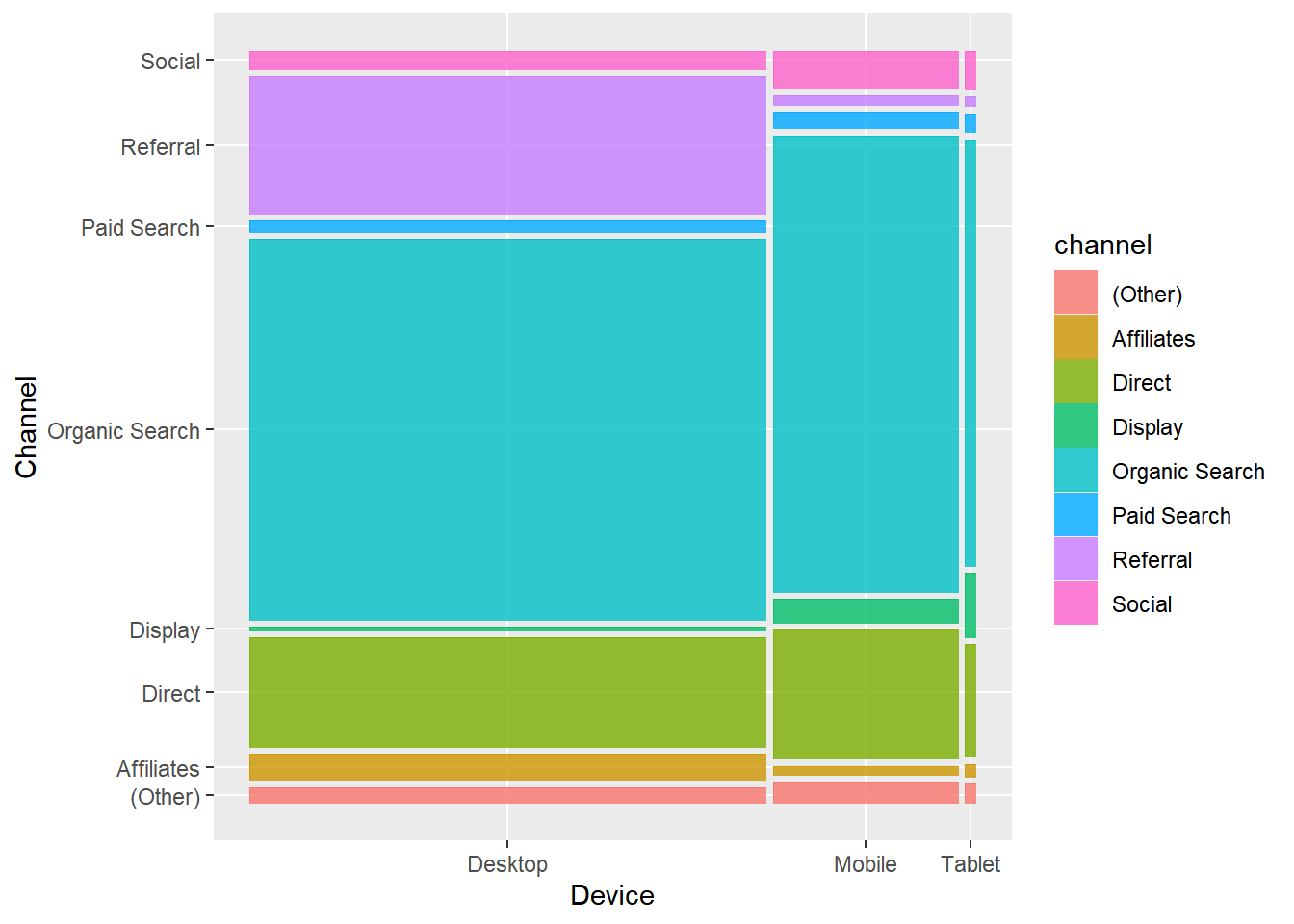
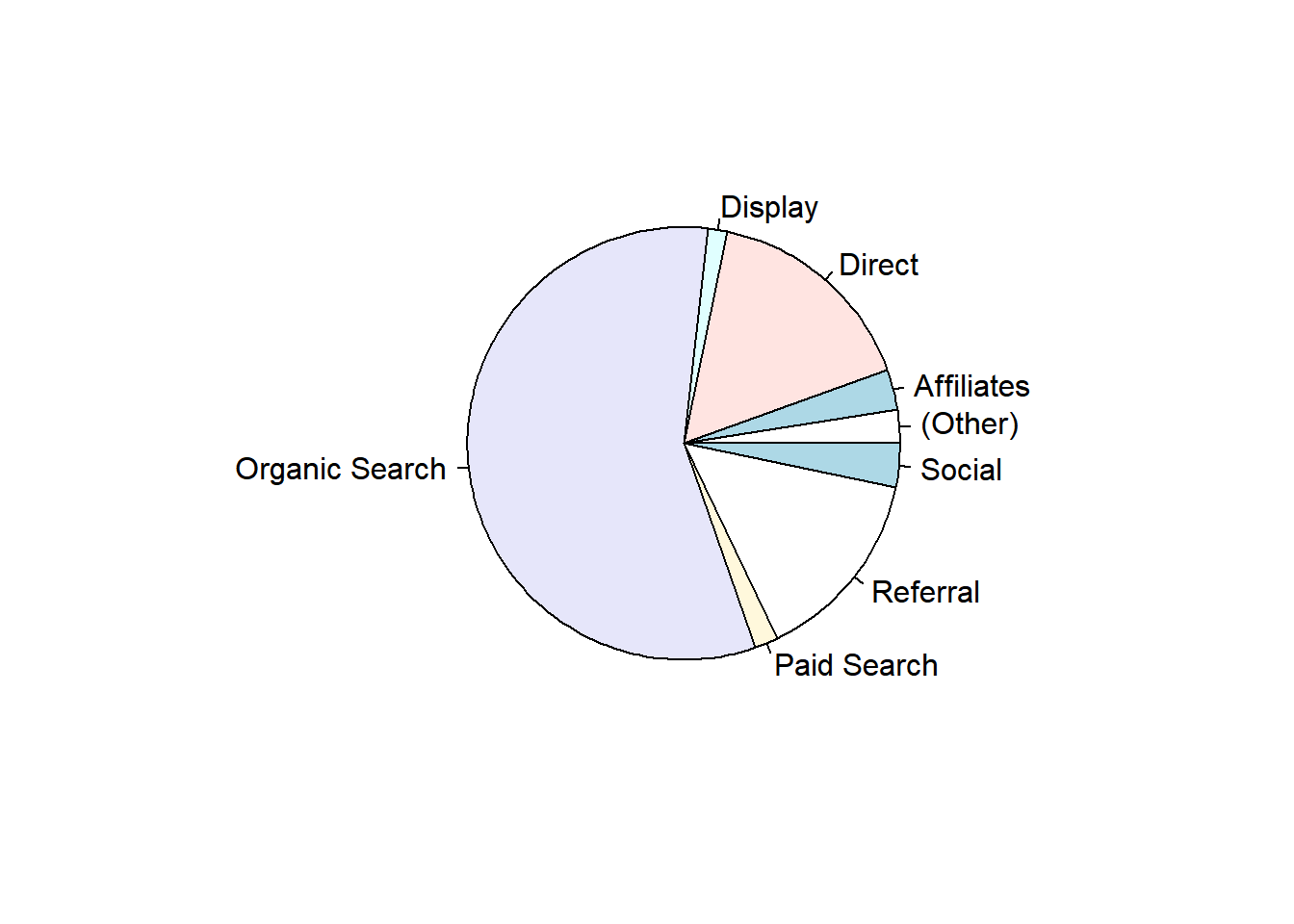
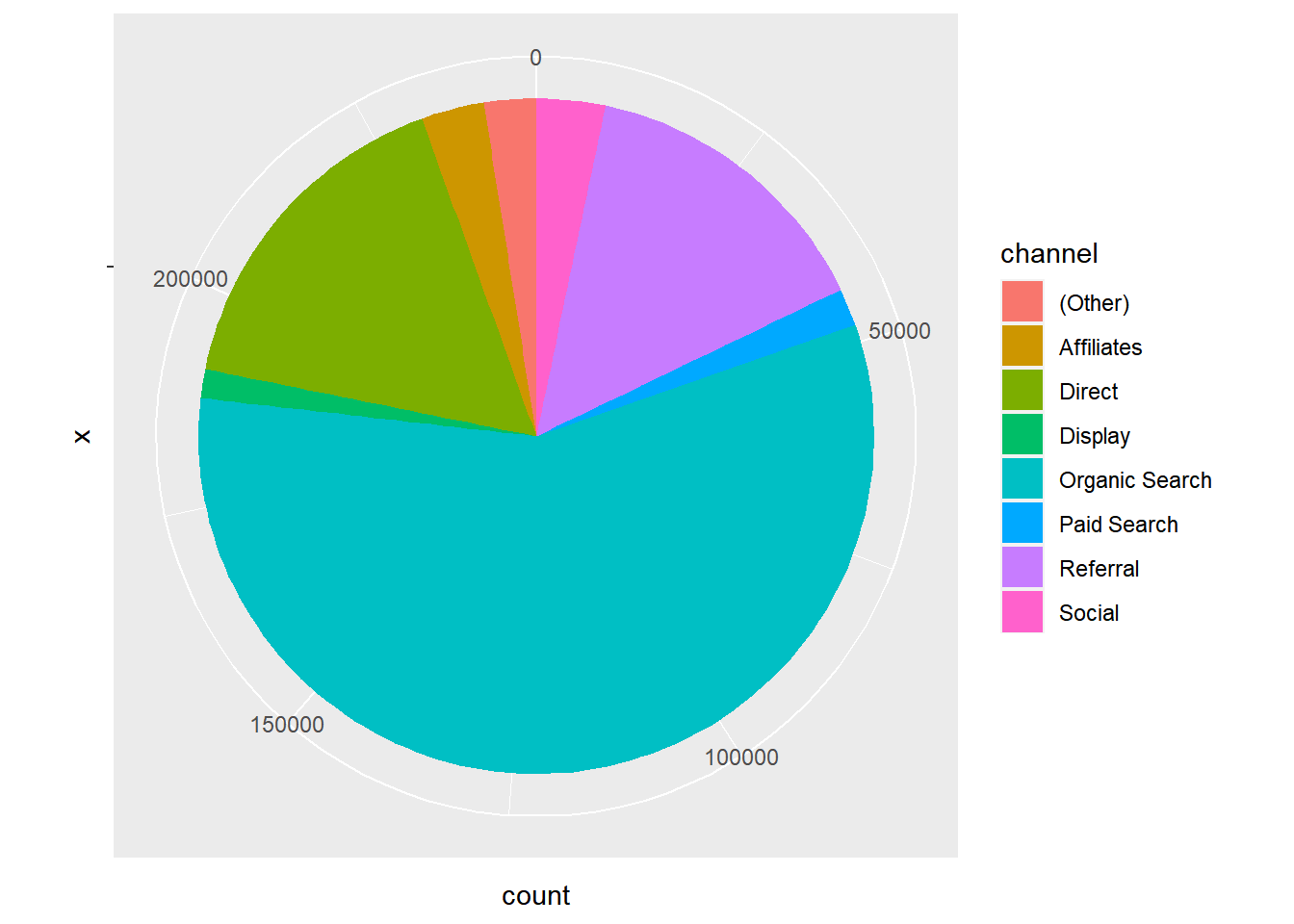
Pie Chart
Pie chart is a circular chart, divided into slices to show relevant sizes of data. It shows the distribution of the different levels of a categorical variable as a circle is divided into radial slices. Each level corresponds with a single slice of the circle and size indicates the proportion of the level. Use it when comparing each group’s contribution to the whole as opposed to comparing groups to each other.
Base R
data %>%
  pull(device) %>%
  table() %>%
  pie()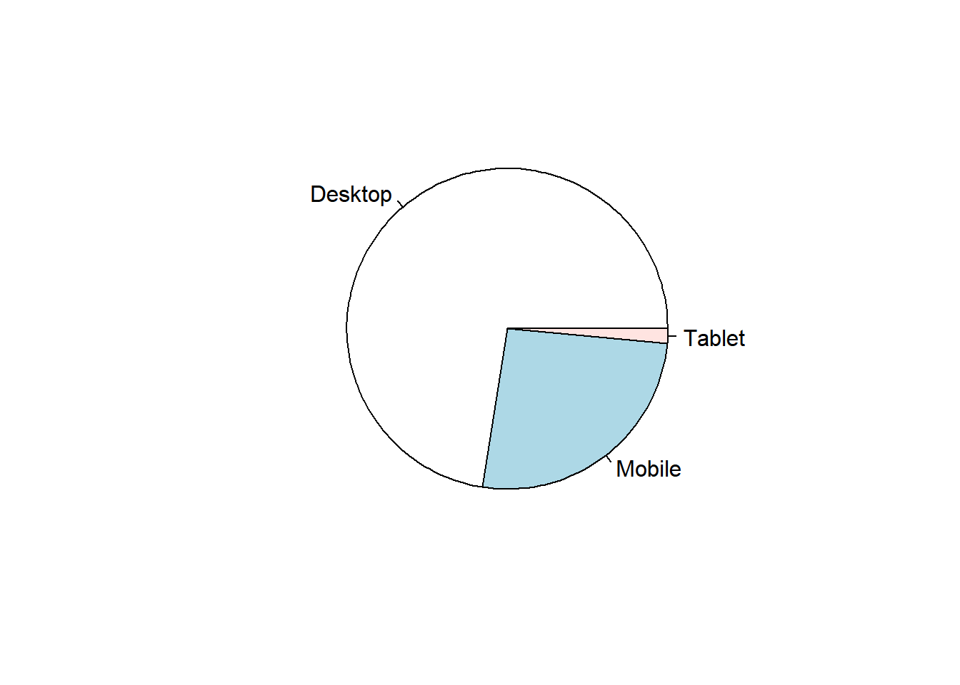
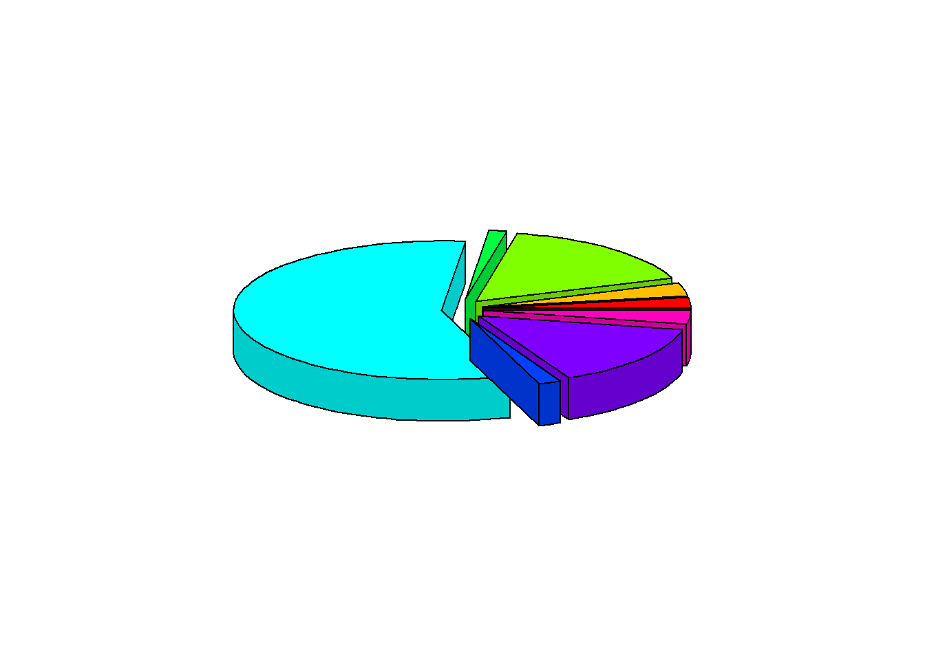
3D Pie Chart
data %>%
  pull(device) %>%
  table() %>%
  pie3D(explode = 0.1)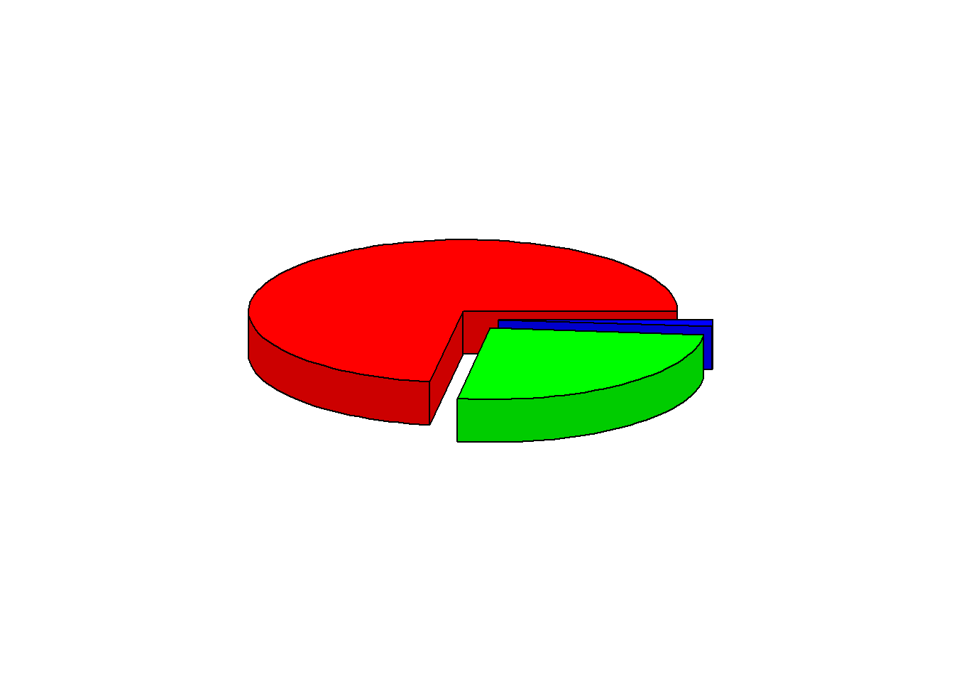
ggplot2
data %>%
  pull(device) %>%
  fct_count() %>%
  rename(device = f, count = n) %>%
  ggplot() +
  geom_bar(aes(x = "", y = count, fill = device), width = 1, stat = "identity") +
  coord_polar("y", start = 0)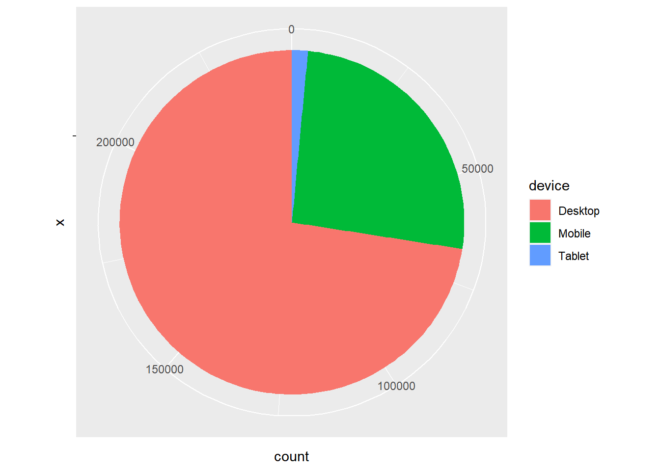
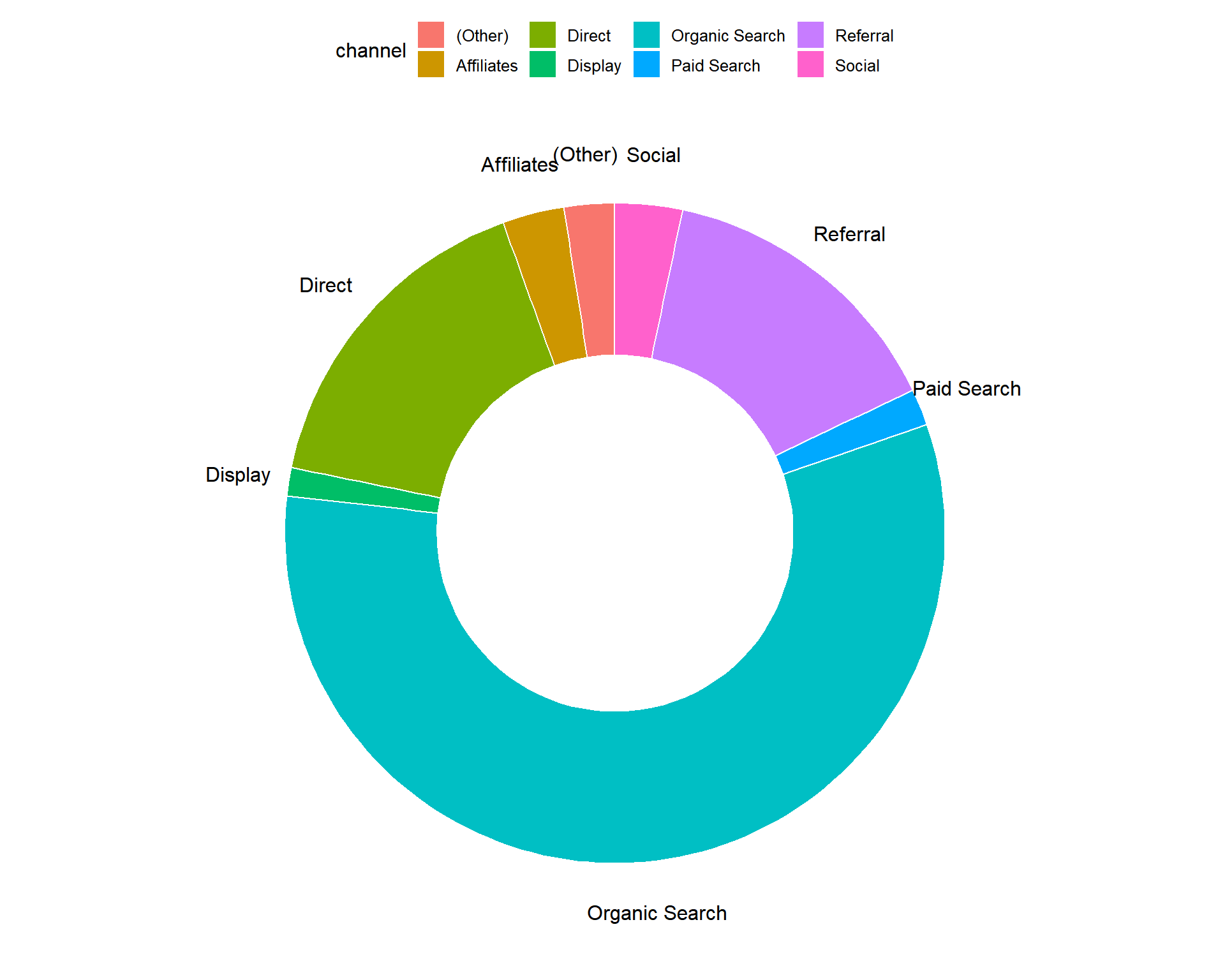
Donut Chart
Donut chart is a variation of the pie chart. It has a round hole in the middle which makes it look like a donut. The focus is on the length of the arcs and not the proportions of the slices. Blank spaces inside donut chart can be used to display information inside it.
data %>%
  pull(device) %>%
  fct_count() %>%
  rename(device = f, count = n) %>%
  ggdonutchart("count", label = "device", fill = "device", color = "white",
               palette = c("#00AFBB", "#E7B800", "#FC4E07"))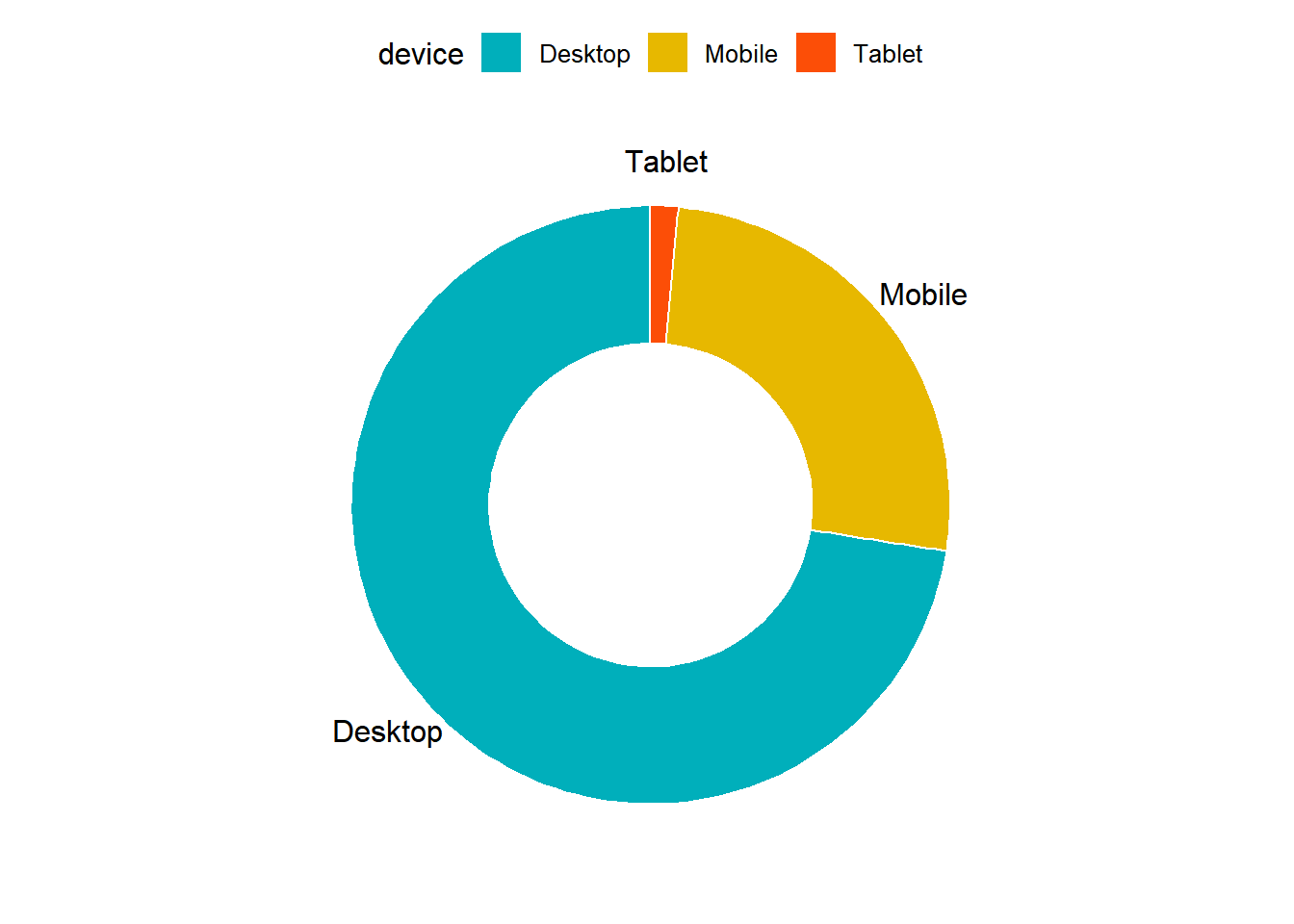
Summary
- Bar charts provide a visual representation of categorical data.
- Use grouped bar chart to make comparison against different categories of data.
- Use stacked bar chart while looking at cumulative data.
- Use proportional bar chart when you want to concurrently observe each of the several variables as they fluctuate.
- Use mosaic plot to discover associations between two variables.
- Use pie chart and donut chart when comparing each group’s contribution to the whole.
Your Turn…
Generate all the below plots:
- Bar plot of
channel
- Display grouped bar plot of
user_typebychannel
- Display stacked bar plot of
channelbygender
- Display proportional bar plot of
channelbydevice
- Display mosaic plot of
devicebychannel
- Display pie or donut chart of
channel
6.1 Pie Chart
6.2 3D Pie Chart
6.3 Pie Chart (ggplot2)
6.4 Donut Chart
*As the reader of this blog, you are our most important critic and commentator. We value your opinion and want to know what we are doing right, what we could do better, what areas you would like to see us publish in, and any other words of wisdom you are willing to pass our way.
We welcome your comments. You can email to let us know what you did or did not like about our blog as well as what we can do to make our post better.*
Email: support@rsquaredacademy.com