ggplot2 - Introduction to geoms
Introduction
This is the third post in the series Elegant Data Visualization with ggplot2. In the previous post, we learnt how to create plots using the qplot() function. In this post, we will create some of the most routinely used plots to explore data using the geom_* functions.
Libraries, Code & Data
We will use the following libraries in this post:
All the data sets used in this post can be found here and code can be downloaded from here.
Data
ecom <- readr::read_csv('https://raw.githubusercontent.com/rsquaredacademy/datasets/master/web.csv')
ecom
## # A tibble: 1,000 x 11
## id referrer device bouncers n_visit n_pages duration country purchase
## <dbl> <chr> <chr> <lgl> <dbl> <dbl> <dbl> <chr> <lgl>
## 1 1 google laptop TRUE 10 1 693 Czech ~ FALSE
## 2 2 yahoo tablet TRUE 9 1 459 Yemen FALSE
## 3 3 direct laptop TRUE 0 1 996 Brazil FALSE
## 4 4 bing tablet FALSE 3 18 468 China TRUE
## 5 5 yahoo mobile TRUE 9 1 955 Poland FALSE
## 6 6 yahoo laptop FALSE 5 5 135 South ~ FALSE
## 7 7 yahoo mobile TRUE 10 1 75 Bangla~ FALSE
## 8 8 direct mobile TRUE 10 1 908 Indone~ FALSE
## 9 9 bing mobile FALSE 3 19 209 Nether~ FALSE
## 10 10 google mobile TRUE 6 1 208 Czech ~ FALSE
## # ... with 990 more rows, and 2 more variables: order_items <dbl>,
## # order_value <dbl>
Data Dictionary
- id: row id
- referrer: referrer website/search engine
- os: operating system
- browser: browser
- device: device used to visit the website
- n_pages: number of pages visited
- duration: time spent on the website (in seconds)
- repeat: frequency of visits
- country: country of origin
- purchase: whether visitor purchased
- order_value: order value of visitor (in dollars)
Scatter Plot
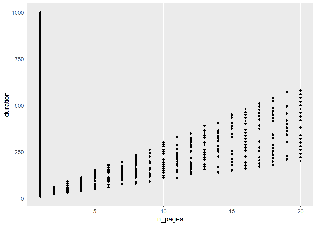
A scatter plot displays the relationship between two continuous variables. In ggplot2, we can build a scatter plot using geom_point(). Scatterplots can show you visually
- the strength of the relationship between the variables
- the direction of the relationship between the variables
- and whether outliers exist
Point
The variables representing the X and Y axis can be specified either in ggplot() or in geom_point(). We will learn to modify the appearance of the points in a different post.
ggplot(ecom, aes(x = n_pages, y = duration)) +
  geom_point()
Regression Line
A regression line can be fit using either:
-
geom_abline() -
geom_smooth()
Regression Line
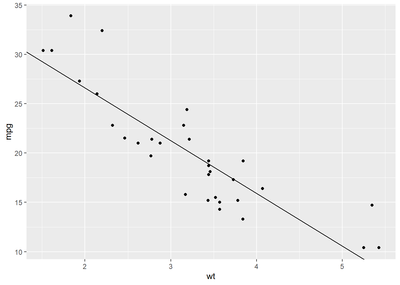
If you are using geom_abline(), you need to specify the intercept and slope as shown in the below example:
ggplot(mtcars, aes(x = wt, y = mpg)) +
  geom_point() +
  geom_abline(intercept = 37.285, slope = -5.344)
Regression Line
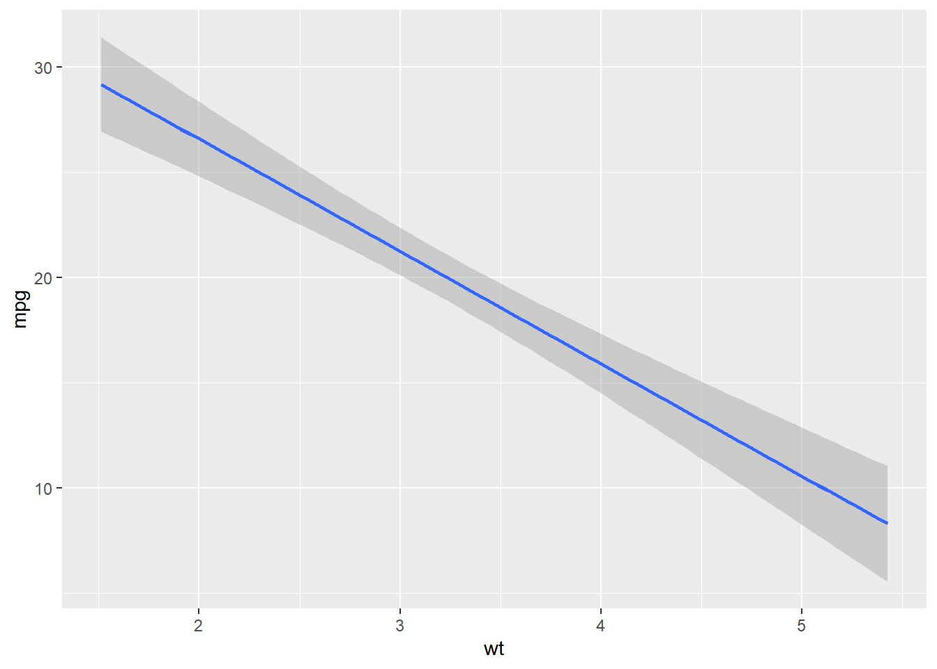
If you are using geom_smooth(), you need to specify the method of fitting the line, which can be lm or loess. You also need to indicate whether the confidence interval must be displayed using the se argument.
ggplot(mtcars, aes(x = wt, y = mpg)) +
  geom_smooth(method = 'lm', se = TRUE)
## `geom_smooth()` using formula 'y ~ x'
Loess Method
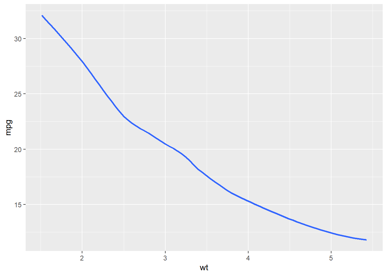
Here we use the ‘loess’ method to fit the regression line.
ggplot(mtcars, aes(x = wt, y = mpg)) +
  geom_smooth(method = 'loess', se = FALSE)
## `geom_smooth()` using formula 'y ~ x'
Horizontal/Vertical Lines
Add horizontal or vertical lines using
-
geom_hline() -
geom_vline()
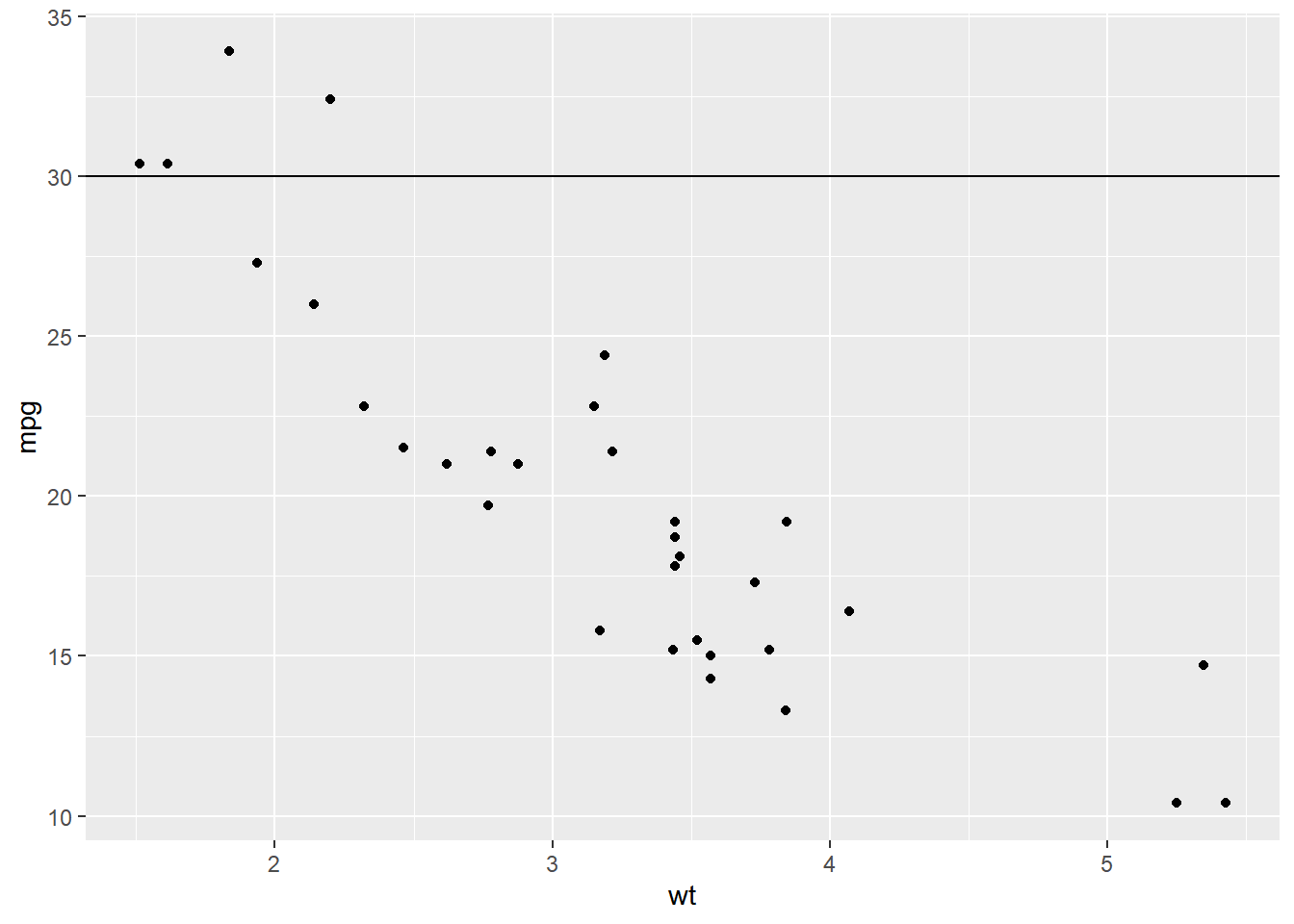
Horizontal Line
To add a horizontal line, the Y axis intercept must be supplied using the yintercept argument.
ggplot(mtcars, aes(x = wt, y = mpg)) +
  geom_point() +
  geom_hline(yintercept = 30)
Vertical Line
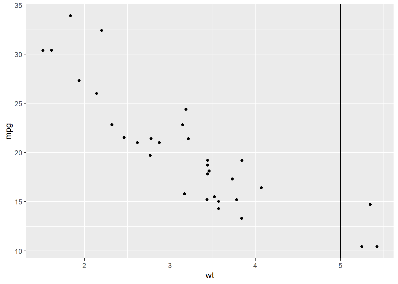
For the vertical line, the X axis intercept must be supplied using the xintercept argument.
ggplot(mtcars, aes(x = wt, y = mpg)) +
  geom_point() +
  geom_vline(xintercept = 5)
Bar Plot
Bar plots present grouped data with rectangular bars. The bars may represent the frequency of the groups or values. Bar plots can be:
- horizontal
- vertical
- grouped
- stacked
- proportional
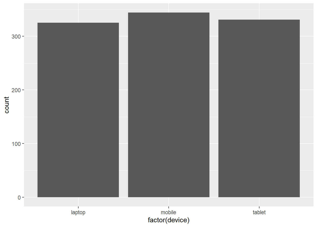
Frequency
ggplot(ecom, aes(x = factor(device))) +
  geom_bar()
Weight
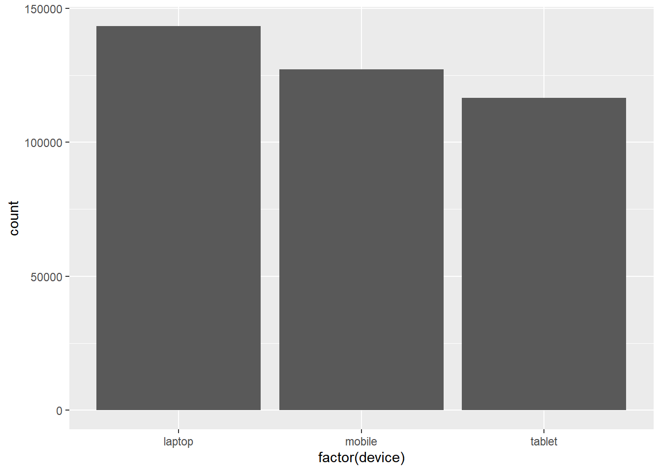
If the bars should represent a continuous variable, use the weight argument within aes(). In the below example, the bars do not represent the count of devices, instead, they represent the total order value for each device type.
ggplot(ecom, aes(x = factor(device))) +
  geom_bar(aes(weight = order_value))
Stacked Bar Plot
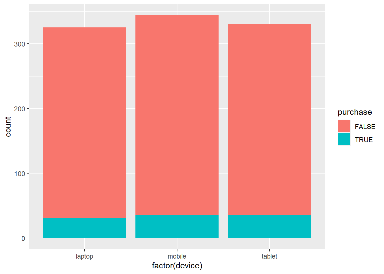
To create a stacked bar plot, the fill argument must be mapped to a categorical variable.
ggplot(ecom, aes(x = factor(device))) +
  geom_bar(aes(fill = purchase))
Horizontal Bar Plot
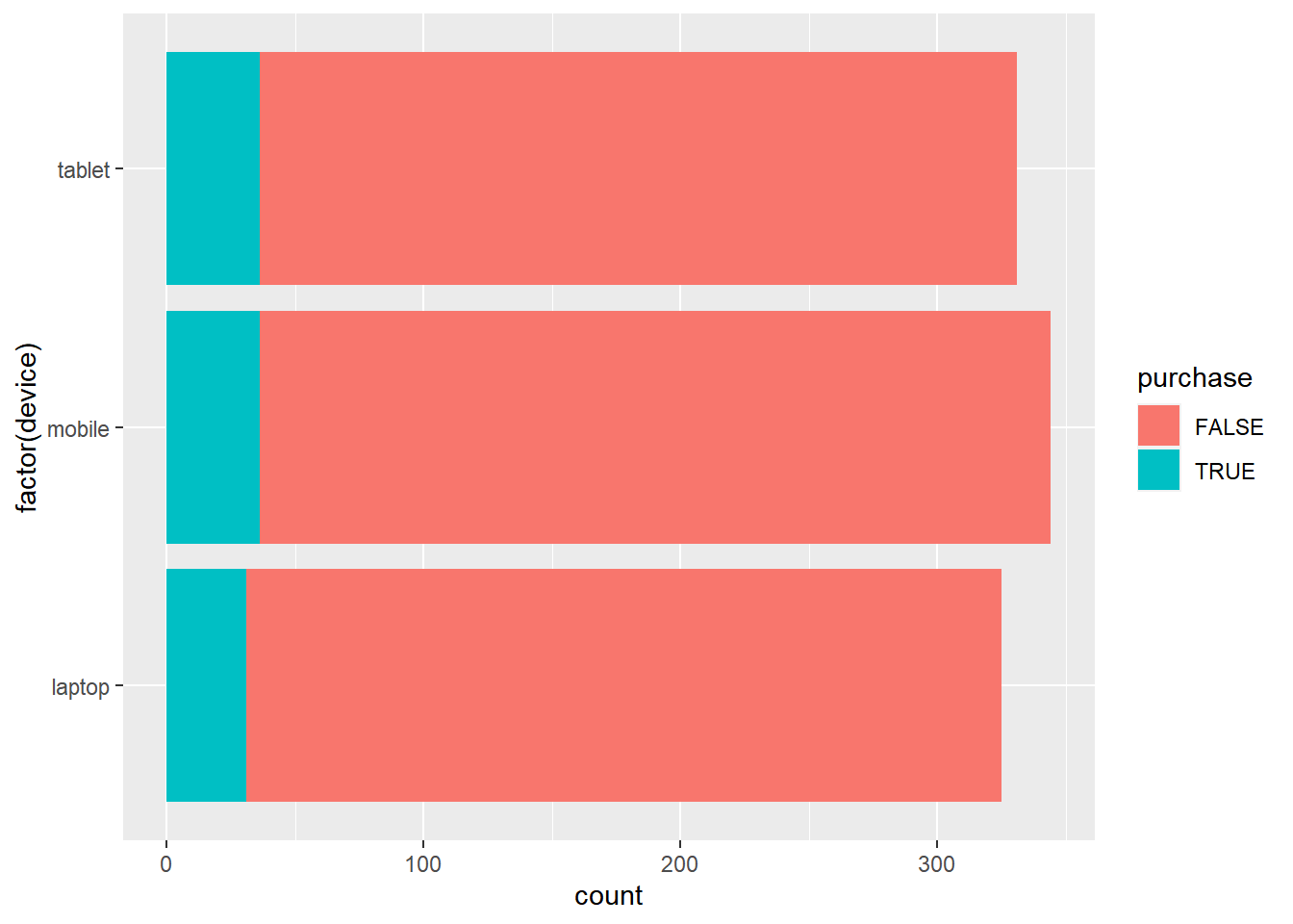
A horizontal bar plot can be created by flipping the coordinate axes using the coord_flip() function.
ggplot(ecom, aes(x = factor(device))) +
  geom_bar(aes(fill = purchase)) +
  coord_flip()
Columns
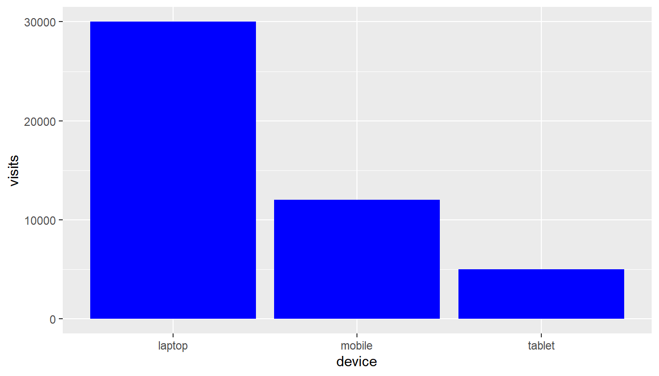
If the data has already been summarized, you can use geom_col() instead of geom_bar(). In the below example, we have the total visits for each device type. The data has already been summarized and as such we cannot use geom_bar().
device <- c('laptop', 'mobile', 'tablet')
visits <- c(30000, 12000, 5000)
traffic <- tibble::tibble(device, visits)
ggplot(traffic, aes(x = device, y = visits)) +
  geom_col(fill = 'blue')
Boxplot
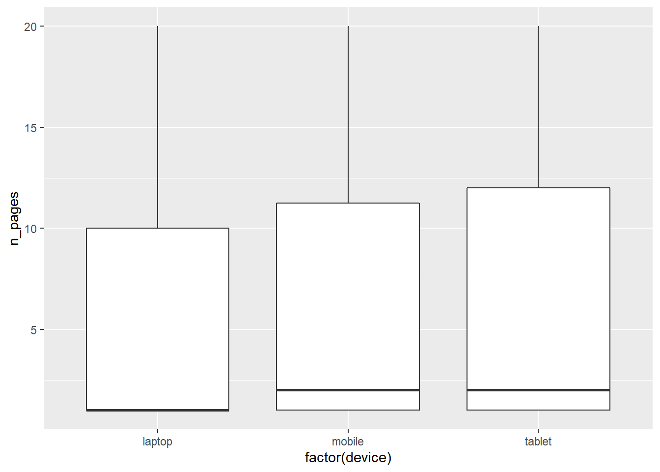
The box plot is a standardized way of displaying the distribution of data based on the five number summary: minimum, first quartile, median, third quartile, and maximum. Box plots are useful for detecting outliers and for comparing distributions. It shows the shape, central tendancy and variability of the data. Use geom_boxplot() to create a box plot.
ggplot(ecom, aes(x = factor(device), y = n_pages)) +
  geom_boxplot()
Histogram
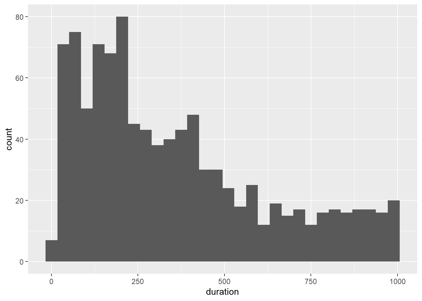
A histogram is a plot that can be used to examine the shape and spread of continuous data. It looks very similar to a bar graph and can be used to detect outliers and skewness in data. Use geom_histogram() to create a histogram.
ggplot(ecom, aes(x = duration)) +
  geom_histogram()
## `stat_bin()` using `bins = 30`. Pick better value with `binwidth`.
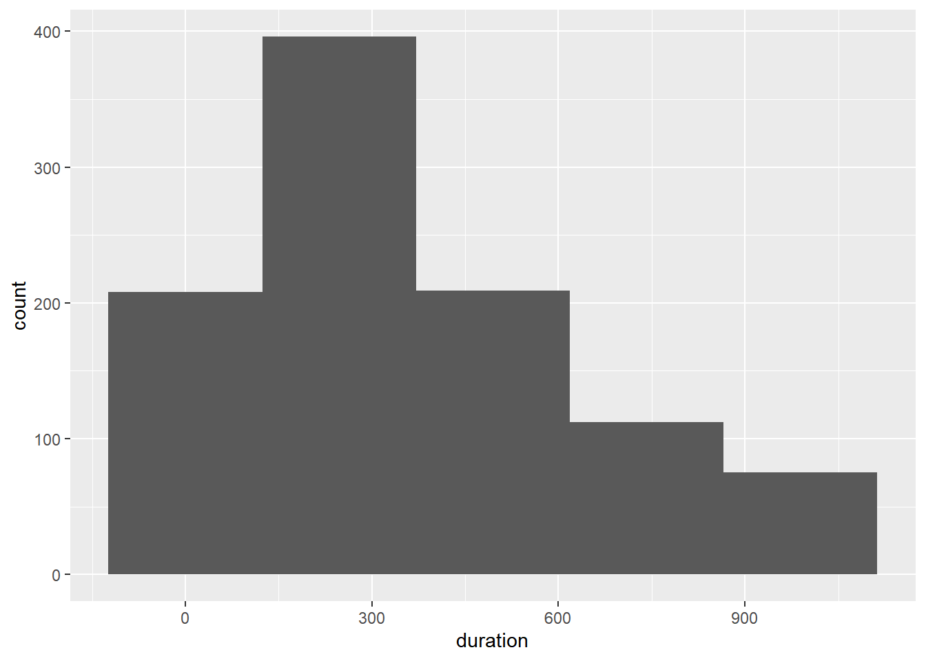
You can control the number of bins using the bins argument.
ggplot(ecom, aes(x = duration)) +
  geom_histogram(bins = 5)
Line
Line charts are used to examine trends over time. We will use a different data set for exploring line plots.
Data
gdp <- readr::read_csv('https://raw.githubusercontent.com/rsquaredacademy/datasets/master/gdp.csv')## Warning: Missing column names filled in: 'X1' [1]gdp## # A tibble: 6 x 6
## X1 X year growth india china
## <dbl> <dbl> <date> <dbl> <dbl> <dbl>
## 1 1 1 2000-01-01 6 5 8
## 2 2 2 2001-01-01 9 9 5
## 3 3 3 2002-01-01 8 8 6
## 4 4 4 2003-01-01 9 8 8
## 5 5 5 2004-01-01 9 5 9
## 6 6 6 2005-01-01 8 7 8
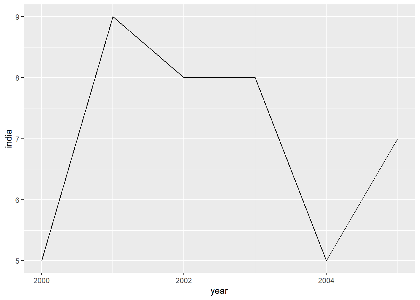
Use geom_line() to create a line chart. In the below plot, we chart the GDP of India, the fastest growing economy in emerging markets, across years.
ggplot(gdp, aes(year, india)) +
  geom_line()
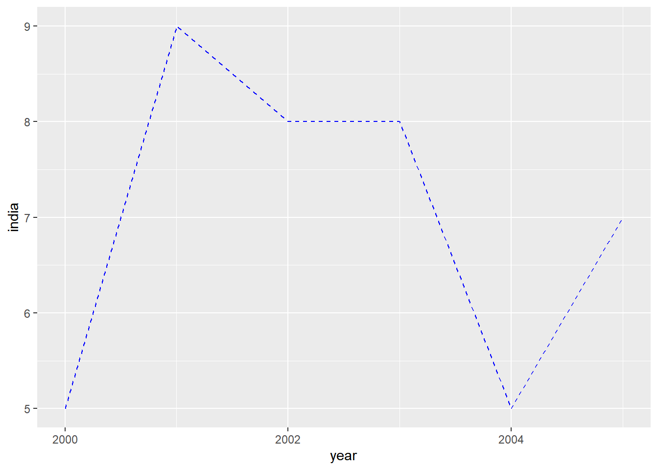
The color and line type can be modified using the color and linetype arguments. We will explore the different line types in an upcoming post.
ggplot(gdp, aes(year, india)) +
  geom_line(color = 'blue', linetype = 'dashed')
Label
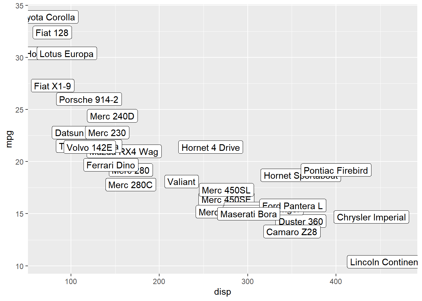
You can label the points using geom_label().
ggplot(mtcars, aes(disp, mpg, label = rownames(mtcars))) +
  geom_label()
Text
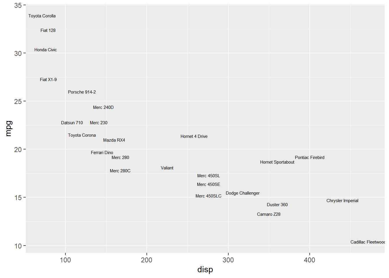
geom_text() offers another way to add text to the plots. We will learn to modify the appearance and location of the text in another post.
ggplot(mtcars, aes(disp, mpg, label = rownames(mtcars))) +
  geom_text(check_overlap = TRUE, size = 2)
Summary
In this post, we learnt about different geoms such as
-
geom_point() -
geom_line() -
geom_histogram() -
geom_bar() -
geom_boxplot() -
geom_abline() -
geom_text()
Up Next..
In the next post, we will learn about aesthetics.